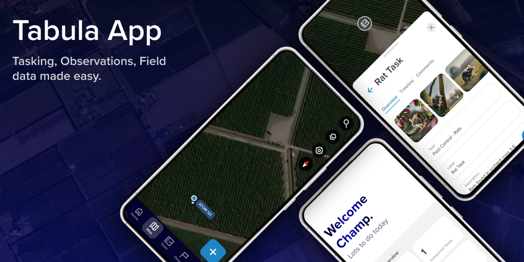
Field Support App
2025
In five weeks I designed and shipped the Field Support app, Tabula's first native mobile app for horticultural field workers. Solo, against a make-or-break deadline, I used AI to manage a shifting brief, prototyped fast, and delivered a polished, genuinely usable experience, navigating tight timelines, strong stakeholders, and messy implementation to ship something modern and ready for the field.
Context
In early 2025 I was tasked with Tabula's first ever mobile app, a ground-up tool for horticultural field workers. It was a major shift for the company and a high-stakes opportunity for me: five weeks from zero to live demo, with no prior mobile experience.
The brief was high priority, high impact, and ruthless on time, a no-smoke-and-mirrors demo solid enough to present to major horticultural clients. Miss the window and we'd miss a year of onboarding, training, and sales.
Constraints
- Time pressure. Five weeks is fast for an app. I'd be building while designing, laying track in front of a moving train.
- Limited user access. I believe in talking to users, but here I had none. Every insight had to come from very senior stakeholders.
- Steep learning curve. My first mobile app. I had to learn platform conventions, decide fast, and justify decisions on the fly.
- High-stakes stakeholder management. Strong personalities and competing visions. I had to hold the core design steady without letting it get pulled apart.
Each could have derailed the project, so I worked to de-risk early and often.
My Role
Sole designer, end-to-end: business goals, design, validation, and documentation. I led the full process under pressure, with no product manager and no mobile experience to lean on.
An AI-First Process
With no PM to filter changing requirements, I leaned on AI as a stand-in teammate, not just for research, but to run the process.
The biggest early challenge was the shifting brief. Business goals, user stories, and spec sheets were all in circulation and changing often. Instead of manually diffing versions, I loaded them into a ChatGPT project and queried them like a shared brain.
I wrote a tailored prompt to simulate a product-minded teammate: it helped me weigh trade-offs, flag inconsistencies, and frame decisions in language that landed with stakeholders. It gave me speed, but also clarity and confidence. This is now part of how I work.
Early Design Work
Before opening Figma, I flew out to work on-site with key stakeholders, including the chairman of the board. Face-to-face meant I could absorb the product vision and get fast feedback on rough concepts. He'd drop in often with strong opinions, but let me drive. That access came with pressure, I owned whether this worked, but it let us move fast.
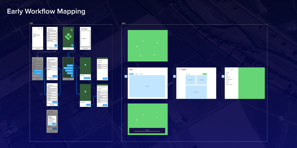
I started analog: post-its, whiteboards, quick sketches. Easy to course-correct, and they let stakeholders see how I was thinking, which built trust.
From Sketch to Screen
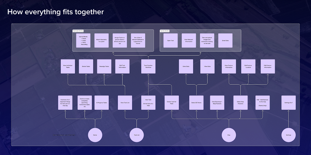
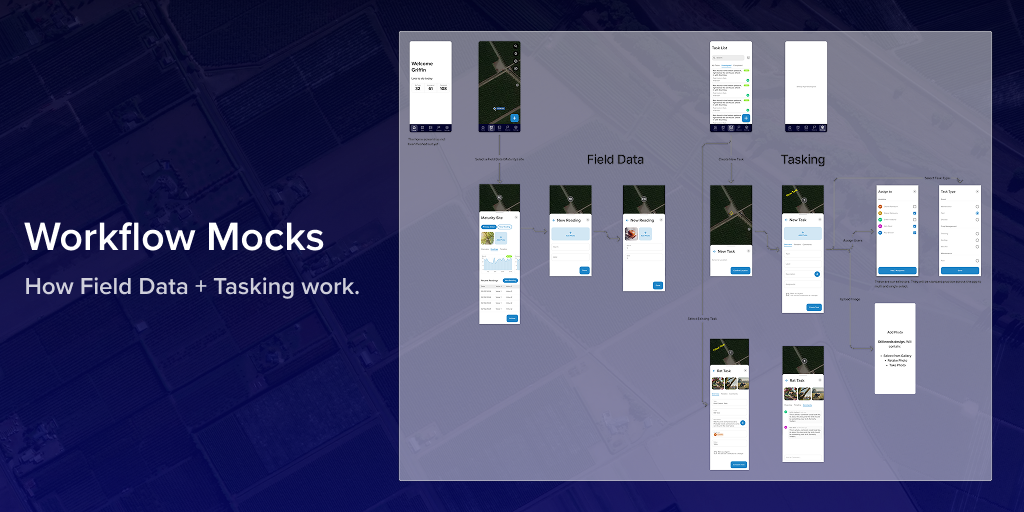
With the core flows validated on paper, I moved into Figma to feel the product in motion. Quick interactive prototypes let me test transitions, dead ends, and navigation, exposing ideas that wouldn't survive contact with real use.
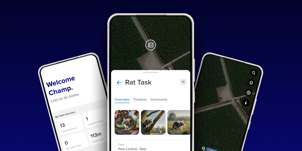
This was the biggest blank canvas I'd had: no inherited UI, no visual system. All mine to define, so I focused early on the feel. I wanted it modern, responsive, and intuitive, especially on mobile, where content and map data get confusing fast. Microinteractions and subtle animation became tools to keep users oriented between screens, including bottom-up slide-in cards that ground users as they move between task lists and jobs on the map.
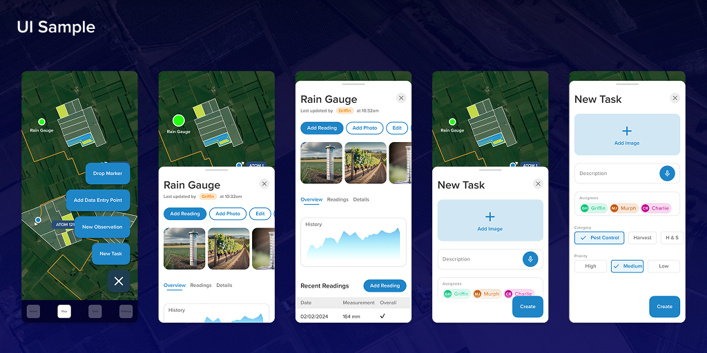
High-Fidelity Design Decisions
In high fidelity I pushed on polish and real-world usability. Rounded corners with iOS corner smoothing made the interface friendlier and less mechanical, important for users who aren't tech-native and often tap in a hurry, outdoors.
Standard guidance puts tap targets at 44 to 48px, but that assumes a bare fingertip. Our users wear gloves, move, and glance for a fraction of a second, so I set a hard floor of 64px on every interactive target. Designing for the actual hand meant fewer mis-taps on bumpy rides and an app that felt trustworthy, not fiddly. Microanimations gave feedback at key moments, expanding the floating action button, opening the home menu, reinforcing flow and continuity.
These refinements turned functional workflows into something intuitive and pleasant under real-world pressure.
Pre-Development Outcome
Going into build, I was confident. The research was solid, every major decision grounded in clear rationale from workflow logic to visual styling. The prototypes felt cohesive and responsive, and I was happy with how UI and UX came together. Stakeholders I worked closest with felt aligned, and there was real momentum. I'd structured the Figma file with care, consistent styles, reusable components, and thoughtful documentation, everything a developer should need to implement it efficiently.
Building the Product
Despite a strong prototype and solid docs, build surfaced new challenges. I expected iteration, but was surprised how little the Figma designs were referenced. Questions I'd already answered visually came back repeatedly, it was clear many hadn't reviewed the designs closely.
Harder still was the feedback itself. There was little positive reinforcement, mostly blunt reactions like "I hate this" or "this doesn't work," with no context or alternatives. Those moments were tough to navigate.
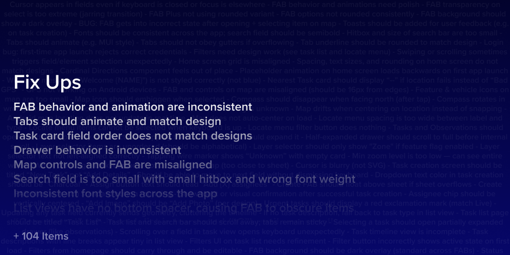
As the first build came together, something felt off, the app felt unnatural, and I started doubting my decisions. Looking closer, it wasn't one issue, it was death by a thousand cuts. Missing fonts. Inconsistent radii. Animations mistimed or skipped. Carefully built components rebuilt in ways that lost their intent. It technically matched the Figma file but emotionally missed.
So I built a polish tracker: a spreadsheet logging every misalignment and design bug. It grew past 100 items, and it shifted the conversation from "is the design wrong?" to "let's fix the implementation."
I also found blind spots in my own work, especially edge cases like empty states and a dedicated view mode for certain tasks. They didn't break the product, but they added friction, and underlined the value of pulling developers and testers in earlier.
Conclusion
Overall it went well. We shipped a working product on time despite the challenges, and most issues were solvable with the right data, clear documentation, and persistent iteration. Designing for agriculture, where good UX in task management and field observation is rare, made it harder and more rewarding.
Beyond the design, I learned how much of product work is navigating people, not pixels: building alignment, handling conflict, and defending user-centred decisions under pressure. For a first native mobile app, I'm proud of how fast it came together and how far it evolved. It sharpened my instincts and left me more confident leading complex, high-impact work under pressure.