Prospector Leatherworks
2024-2025
A heritage leather brand and website I built from the ground up, blending digital design with hands-on craft. Over eight weeks of active development I designed the brand identity, built a static website, and shipped a complete digital presence that reflects the slow, honest craft of Otago's gold-rush heritage.
Context
In mid-2024 I started making leather goods, belts, camera straps, and conditioning balm, as a creative outlet away from screens. A hands-on hobby quickly became something more: a brand blending heritage craftsmanship with modern product thinking.
Prospector Leatherworks draws on the patient, honest work of Otago's 1860s gold rush. These are real products for real people, built to last. The positioning was clear from the start: heritage-inspired, design-led, built to wear in, not out. I worked solo across design, code, and content, from brand identity to website to product photography.
The Challenge
This was more than a website, it was a complete brand presence from scratch:
- Brand identity. A visual language, typography, and voice true to both the craft and the story.
- Website architecture. A fast, maintainable static site that reflected the premium, artisanal positioning.
- Content creation. Product photography, copy, and a workshop gallery that builds trust.
- Technical foundation. Hosting, analytics, and forms without backend infrastructure.
It ran across eight weeks of active development, documented in 21 commits that trace the path from placeholder site to polished brand.
Design Philosophy
I approached it with a design-systems mindset, even for a static site. Every decision had to be intentional, reusable, and grounded in the brand's heritage.
The visual language centres on a custom grain-texture system using SVG noise filters, subtle enough to feel premium, present enough to evoke leather's tactile quality. I moved from pill-style rounded corners to Apple-inspired subtle rounding for a more sophisticated, less toy-like interface.
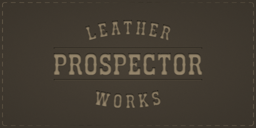
Typography was critical. I started with PP Rader (clean, modern) but it felt too polished for a rustic craft brand, so I switched to Cowboy Outlaw, a textured, western-inspired typeface that instantly anchored the brand in its gold-rush heritage. That one change cut font file size by 75% while strengthening the identity.
Development Process
Development was iterative and commit-driven. The first commit, 26 November 2024, set the foundation: homepage structure, placeholder images, and a 12-column grid. From there it moved in phases.
Foundation (Week 1): Three product pages (The Hunter, The Prospector, The Trailblazer) on a consistent template, each a two-column grid with image gallery and product details, back navigation, and serial numbering for a limited-edition feel. Custom domain configured.
Content Expansion (December): Replaced placeholders with professional product photography and added a fourth product line. Integrated Google Analytics and Notion forms for interest capture, avoiding backend complexity. Refactored monolithic inline styles into modular architecture.
Polish (January 2025): Where the craft really showed. I rolled out the grain-texture system site-wide, hero sections at 15%, product images at 12%, navbar at 8%, for depth that mimics leather. Built a full mobile nav with hamburger, slide-out drawer, and proper accessibility, and centralised navigation into a single function, removing 255 lines of redundant code.
Key Technical Decisions
Grain texture system: instead of image overlays, inline SVG fractal noise filters. No extra requests, perfect scaling at any resolution, and per-section opacity, a subtle film-grain that suggests quality without overwhelming the content.
Hero section: a simple gradient became a layered composition, full-viewport photo, dark overlay, grain layer, and radial vignette, with slight desaturation and a contrast boost for a weathered, vintage look.
Image animations: a directional slide system with animation locking, so transition direction matches the thumbnail flow, with smooth easing for natural motion.
Performance: despite high-res imagery, the site stays fast through async script loading, modular CSS for caching, and removing unused fonts.
Content Strategy
Product pages follow a consistent narrative: hero image, tagline, price, description, specs, and call to action. But I deliberately avoided pushy "Buy Now" prompts, confident brands don't need to push. The copy focuses on craft, materials, and story over hard selling.
The workshop gallery was key for trust. Twelve images of tools, leather, and process show this is real, hands-on craftsmanship, not dropshipped goods with a heritage story bolted on.
Outcome
After eight weeks, Prospector Leatherworks has a complete digital presence: four product pages, a workshop gallery, custom domain, analytics, and a mobile-optimised experience. It's live at prospector.nz and ready for the next phase, Shopify integration for e-commerce.
The project reinforced a core belief: good design isn't just how things look, it's how they're built. Treating a static site with the rigour of a product design system made something maintainable, performant, and true to the brand.
More than anything, Prospector proved that design craft and physical craft aren't separate disciplines, they're both about patience, iteration, and honest work. The site feels like the leather goods it represents: built to last, refined through use, and better for the attention paid to detail.