AirVision Guidance Revamp
2024
A ground-up redesign of Tabula's aviation guidance system: safer, faster, and built around how New Zealand's top agricultural pilots actually fly. From brittle legacy tech to a best-in-class cockpit experience.
Context
In 2024 I joined AirVision two months before a major release, first as a user tester, then as lead UX designer. The brief: replace aging, unreliable legacy hardware and software with a guidance tablet ready for real pilots, real flights, and real stakes.
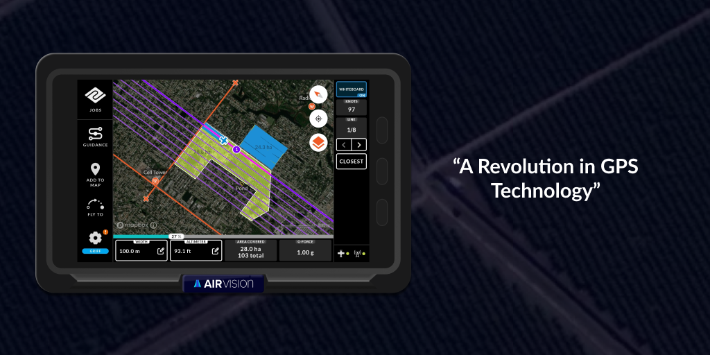
The system does two critical jobs: it records proof of fertiliser and spray application, and it gives pilots live guidance patterns to fly the safest, most efficient lines over complex farmland.
Stakes were high. Missing the release window meant setting the business back a year on training, onboarding, and sales. The product had to feel robust and ready to fly, straight out of the box.
Constraints
- Legacy dependencies. The original product (Flight3) was flexible but unreliable and hard to update. High support volume, yet still loved by pilots for its configurability.
- Complex, busy users. Ag pilots are expert and change-resistant. They work at high speed and low altitude, with every finger already doing something critical.
- Hazard avoidance. Powerlines are a leading cause of fatal aviation accidents. The system had to make safety more visible, not less.
- Multiple pilots, shared aircraft. Each pilot needs their own setup instantly, with no time lost to reconfiguration.
- Real-time hardware integration. It had to work seamlessly with in-cockpit hardware, with minimal distraction.
Any one of these could have derailed the project if not surfaced early.
My role
I moved quickly from user tester to sole UX designer, working end-to-end: domain research, pilot interviews, design, prototyping, and documentation.
With no aviation background, I had to get up to speed fast. I became a domain translator, interviewing pilots, shadowing product owners, and decoding legacy logic into modern, usable flows, from first concept through to design QA and handoff.
Research & early work
I started in existing feedback, legacy support tickets, and the cockpit itself, mapping the most common flight patterns, pilot pain points, and job types the old system handled.
Empathy interviews surfaced subtle but powerful insights. Experienced pilots often said they were satisfied, but their workarounds told a different story: critical features were hard to use or buried in deep settings. I learned to listen to how pilots said things, not just what they said.
- Frustration when things behaved unexpectedly
- Features that worked but weren't actually useful
- Hidden UX gaps fixable without losing power or flexibility
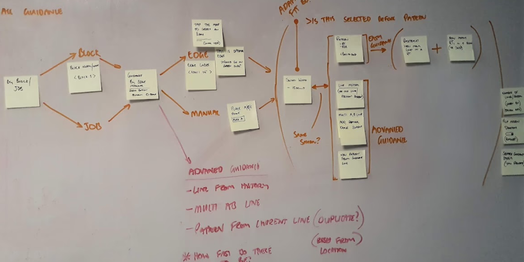
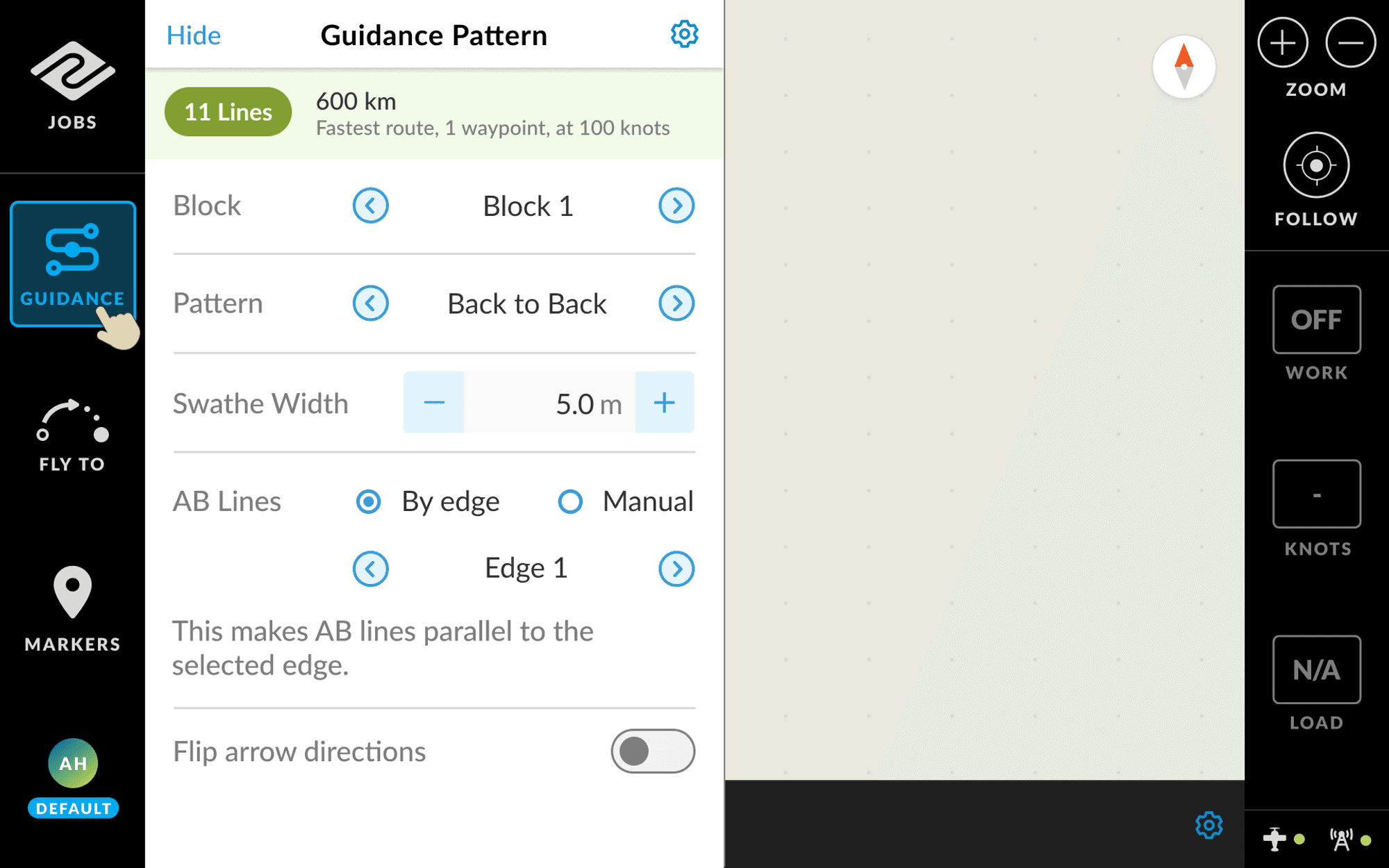
One feature came up again and again: the Guidance Card. Powerful, but overwhelming and hard to use in-flight.
Designing the guidance card
The new Guidance Card had to let pilots:
- Recall and reuse previous guidance lines
- Set up multiple A-B lines per job
- Generate new flight patterns on the fly
- Guide an entire job or a single block
All in a UI that's glanceable and operable at 250kph, metres above the ground.
I mapped every existing and proposed pattern as a "logic tree," diagramming the decisions and inputs each setup needs, from a simple straight line to a complex multi-block pattern. Isolating the most common cases let me streamline the UI for 80% of workflows while keeping the rest as advanced options.
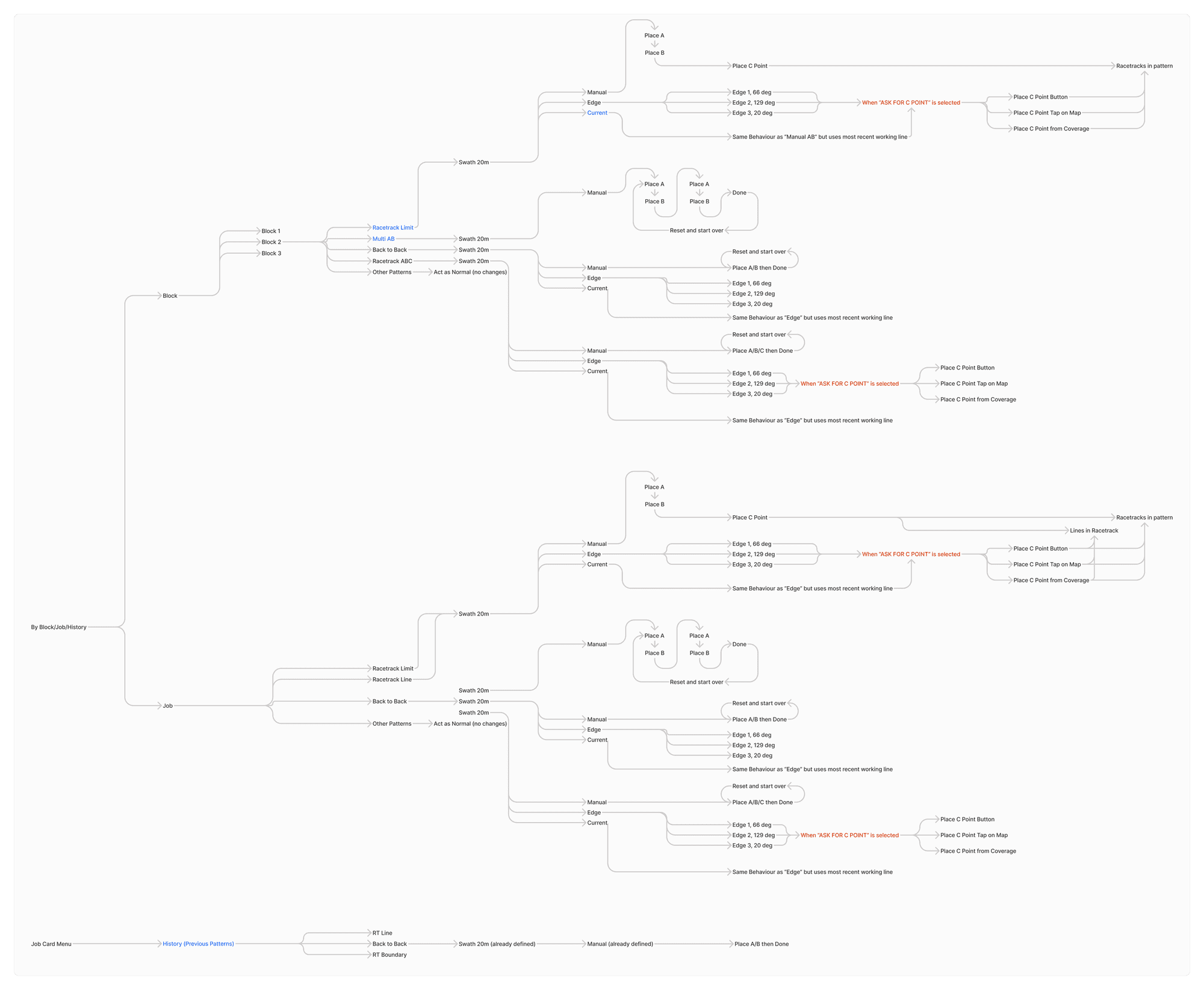
Then I moved to Figma with one core goal: keep everything on one screen, no scrolling, even as we doubled the functionality.
Field testing was essential. I trialled the simplest and most complex versions, tuning buttons, quick actions, and visual cues. Pilots were clear: job-based guidance should be the default, block-based the power feature, and heading visibility is critical for coordinating between pilots and avoiding overlap or collision.
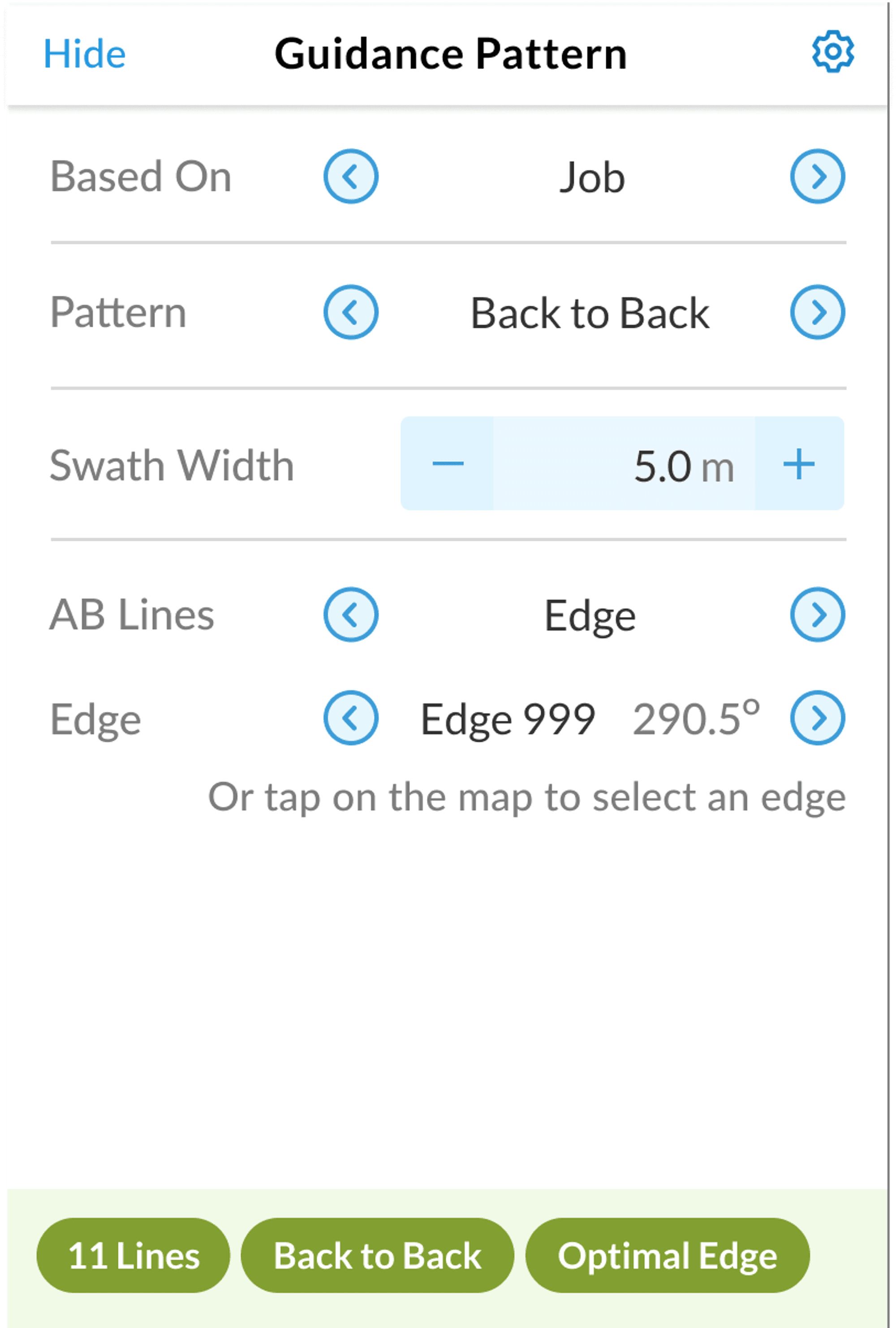
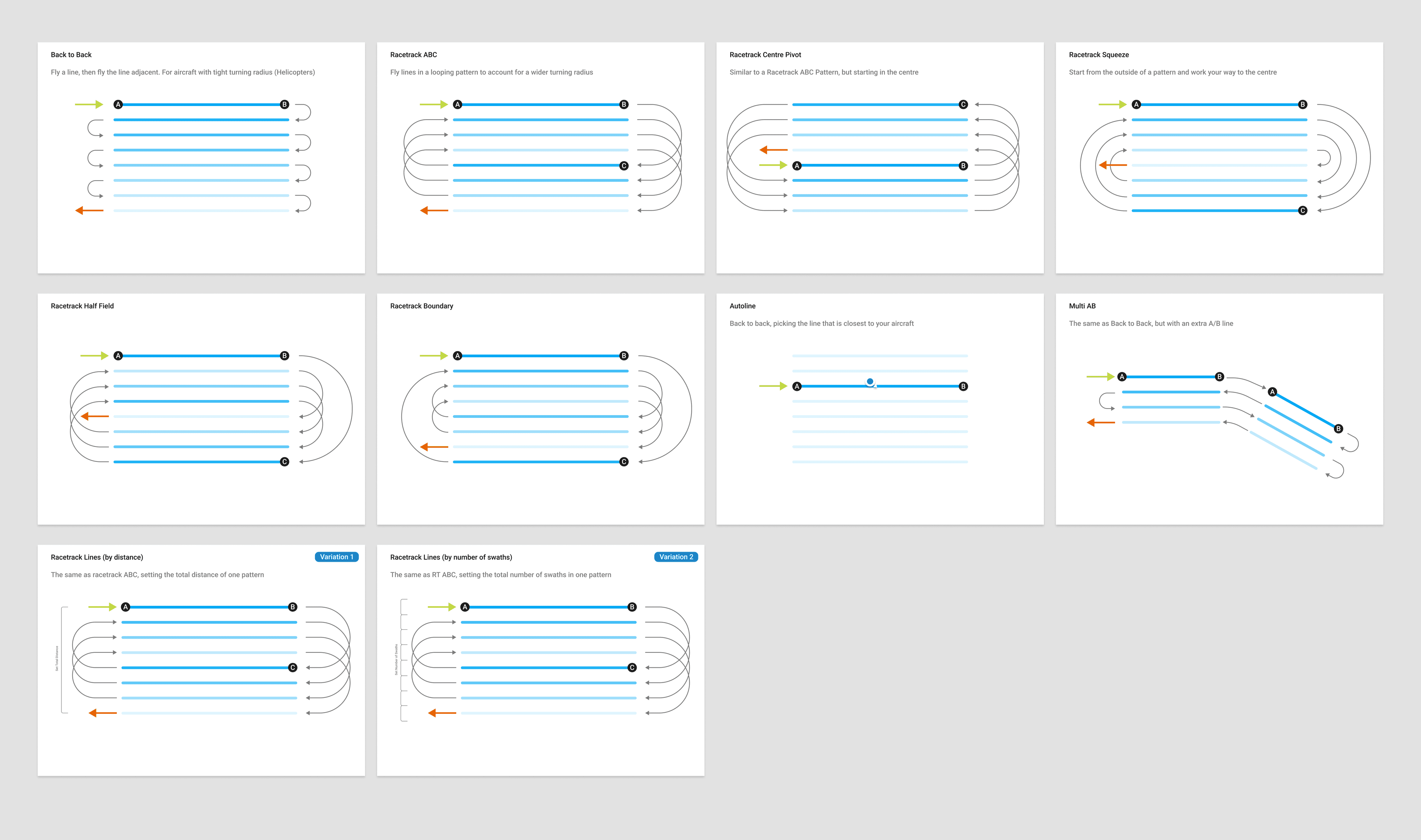
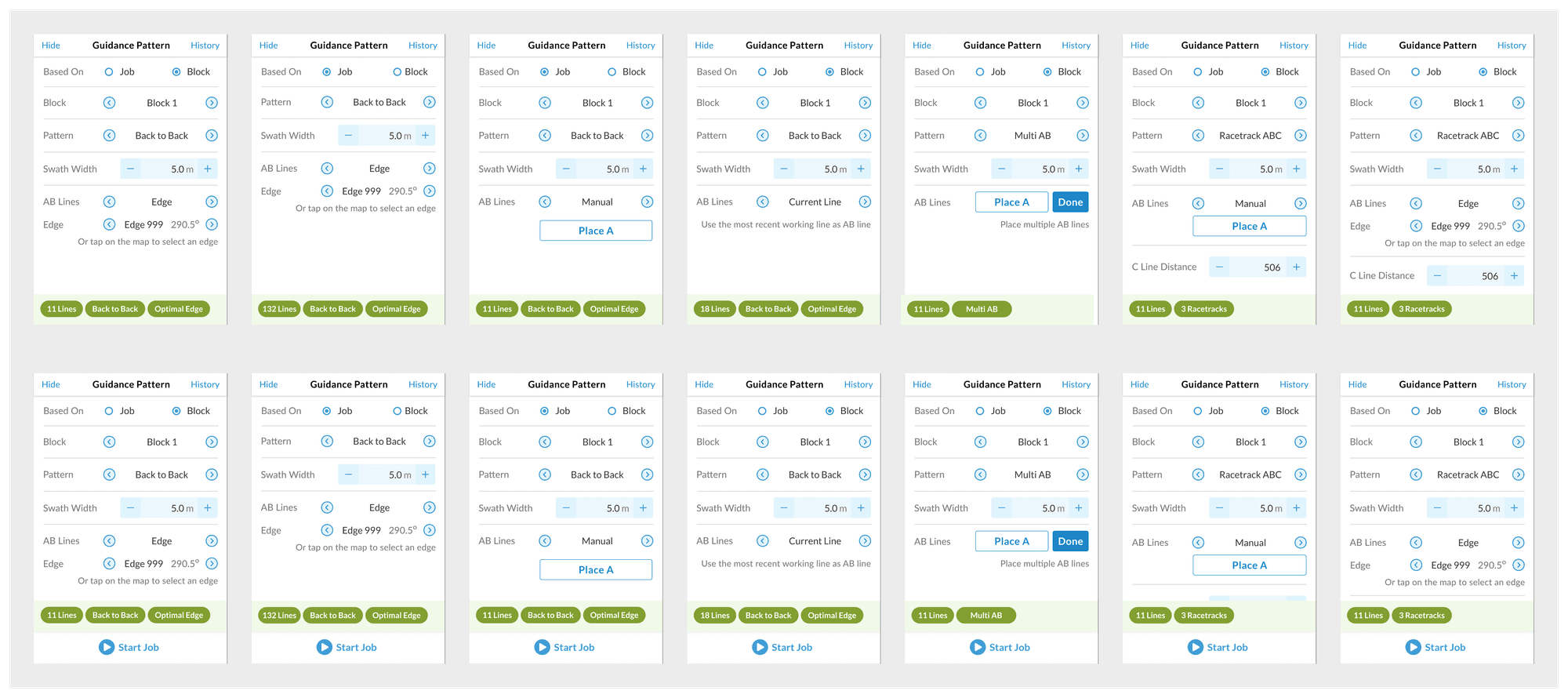
The final design supported every key pattern, was field-tested for clarity, and made setup genuinely fast and safe for any pilot. A few of the combinations:
Outcome
AirVision shipped as a radically more usable product. Pilots could carry settings between aircraft, sidestep the old system's pitfalls, and operate safely at speed. It rebuilt trust with both the business and our most demanding users, proof that real UX work moves the needle even in specialist, high-risk domains.
- Pilot settings carry between aircraft, saving precious setup time
- Guidance and safety data always at hand, no extra steps
- Support calls down, confidence up, strong feedback from the field
What I learned
Designing for aviation is humbling. Your users are skilled, direct, and have zero time for fluff. Empathy here means reading between the lines, seeing past what pilots say to what they actually need.
It sharpened how I map complexity, align on what matters, and ship real improvements on time, in the real world.
It also reflects how I work now. As an AI-enabled designer I don't just hand off and hope, I can reach into the codebase to help ship what I've designed, keeping intent intact from idea to the screen in the pilot's hands.